Main

22.03.09

Linux Libertine - Free the Times and make it better

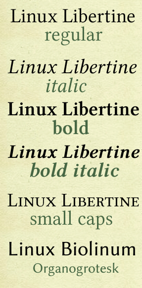
linuxlibertine.pngFree fonts are such thing, most are ugly or just plain copies or incomplete or in the end have the same copyright restrictments as the for pay high quality fonts (mostly because the authors didn´t apply a alternative copyright to them) so its nice to see that there are more and more fonts coming to the table that have less restrictive copyright or are free in the whole sense. Even better it is when said fonts are of high quality - or if they are copying an already available font - make it even better quality. That happened to the Times New Roman - the most controversial font of modern time (or so some say). Blessed with an open source linux compatible license the creators made Linux Libertine even better then the original (and maybe even usable at all?). Everyone can grab a copy for free. Its in the OpenType format and spans all characters that you would ever need in a font and a regular, italic, bold, bolditalic, small caps and - hold you breath - a Organic Grotesk (non-linear sans-serif) version.

http://linuxlibertine.sourceforge.net

via @murdelta.

11.02.09

How fast can you talk?

This 30 year old FedEx commercial has the fastest talking person in that I have ever seen. I wonder if the human race "evolves" talking this fast one day. Funny as hell too.

6.02.09

E-Paper at last

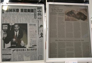
epaper-taiwan-24-inch-wow-rm-eng.jpegThe thing you see in Sci Fi movies - moving wallpapers and newspapers that update as the news happen. It has been a long time coming with first time mention of a working e-paper technology was like 10 years ago at least. While there have been ebook readers in first generation and magic ones with unicorn hairs embedded the real first epaper that really knocks me of my feet is the one shown here at a Taiwanese Book show. Impressive big clear crisp paper like and even the cmyk colors are there. Now just holographic storage quantum computing and some solution to the pesky energy problem and we are all set for a sciFi future…

via Engadget

5.02.09

crowdSpring the end of the design bussiness

It had to happen and I like how it happens. The bussiness I trained for in long years will not be the same anymore. CrowdSpring is a website aimed at destroying the "professional" design market once and for all - that is the multithousand dollar design projects that made circular logos with helvetica. What the website does is let a company make an offer for designs like logos, website etc. For example a logo goes between $200-$1000 at the moment - thats about the money a professional design firm asks just to come to the first meeting. Then everyone and their dog can submit logos and the design company can then select the one they want and the recipient gets the money - no matter where he/she is - in bed or in the high decorated office with the $2000 lean back chair. I am more then certain that this will catch on big time and in the process will probably completely wipe out the "pro" design market with its (wo)man in black. This is especially true in a time when firm want to cut costs and there are more firms doing inhouse design for the more complex stuff (like supervising a CI).
So if you need a logo go to crowdSpring offer $300 and get 1000 custom made for you to choose from in return.

And for the snooty designer out there - its gonna hit everybody.

29.01.09

The Story of a Runic Stone

This has to be the best museum installation I have ever seen. It presents the original exhebition piece - the runic stone Mejlbystenen. It explains its meaning - it invites to play - it looks pretty and its provides room for imagination thus making the stone itself an interface between the old and new world. Absolutely stunning.

20.01.09

COnsume more - the font

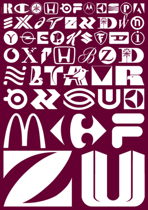
consume-Sample.jpegConsumeMoreFontSheet.pngFor everybody to get the message out: CONSUME MORE TO SAVE THE WORLD - here now the font to the campaign (just kidding of course but the font is real).

From SMeltery the friendly french font foundry and yes its free for all to download.

15.01.09

Adbusting in Berlin - Photoshopping a Model

photoshop_adbusting_berlin_3-600x398.jpegphotoshop_adbusting_berlin_1-600x398.jpegI really love this idea of adbusting that is going on in Berlin at various locations. It makes the poster look like its being worked on in Photoshop showing how to fake the look of the "stars" with gloomybloomylayers and lots of gaussian blurs and stamp brushes to eradicate any signs of real life like aging, pimples and natural spots on the skin. In addition it adds some subliminal messages to it - like the "consume" layer - I am sure some advertisement companies would love the patent on that one :)

More over at brandinfection

12.12.08

The Evolution of Logos

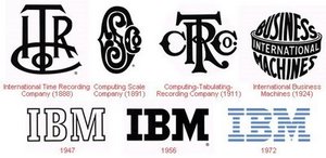
logo-ibm.jpgIn CI class in university there was some talk about how logos evolved and I have some outstanding books on the logo design with some of these evolutions in it - yet here comes a webpage that has the biggest collection of logo evolution on it that I have seen - from the know (apple, shell) to the more unknown (nokia - hahah). Its a VERY good look at logo culture. Shown here is the IBM logo - the most interesting evolution to me.

Get the rest over at best-ad.

12.11.08

Iraq War Ends! Sadly its just a spoof

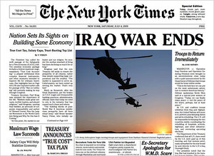
12times-480.jpgCommuters in New York got a nice surprise this morning when they got handed a free edition of the New York Times with the main headline "Iraw War Ends!". The paper had all section of the normal New York times but was filled with the wet dreams of leftist environmentalist progressives. The back cover even had an advertisement for KBR (thats the "company" doing "reconstruction" in Iraq). The paper was normally printed so it actually had the look and feel of the original - but it wasn´t. Its probably the most elaborate hoax since faking the french president to Sarah Palin - and maybe even bigger - it has at least as much impact because it actually describes in a nonfictional fiction way on what the world would look like with sane leaders. I really really dig that fictionreality mixing (something we here at the prototypen are planning for next year - mixing reality with fiction and making it a political statement). This actually educates people while entertains people while it makes all its own promotion on itself. Pure geniuous. Word on the street is that it was a job of The Yes Man. Here is also a video:


New York Times Special Edition Video News Release - Nov. 12, 2008 from H Schweppes on Vimeo.

11.11.08

Typo Porn: Lou Dorfsman and the CBS Wall

Lou Dorfsman is the person who founded CBS Television - on of the big TV stations in the US - interestingly to have his own media channel. He was also a designer. When in the meeting room of CBS the question was how to decorate a wall Dorfsman had the idea to make a giant typesetting drawer filled with words made out of different typefaces in 3d.
There is an article available at designrelated and then there is a small documentary about the wall:

28.09.08

Blinkenlights: iPhone App released

BlinkenLightsiPhoneSim.pngThe Blinkenlights iPhone application is released and available on the appstore so you can watch the stream of pixels as it appears (or should appear ones its working) on the house on you iPhone with different viewpoints.


iPhone BlinkenSim on the Appstore

14.09.08

Why we drink


12.08.08

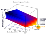
Very good Tutorials for Photographing from novice to elite

exposure.pngI stumbled upon this site that is actually a gallery website for a photographer named Andre Gunther. In addition to having some pretty photographs on his site he also has an extensive blog with tons of tutorials on how to shoot good photographs. The expertise level of the tutorial ranges from the novice to the expert. Quite great. Or do you know how to best photograph fireworks?

Get the Andre Gunthers tutorials here.

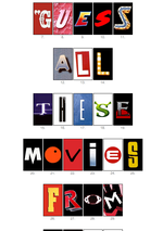
Can you guess what movie by only one letter?

movieletters.pngThis is a fun thing for a change and I was amazed how good I actually was - I got 15 right (and I am neither a movie nor a typo buff). You get a page full of pictures of letters that are from movie posters/titles and you guess which movie it was - you can cheat by clicking on the letter to see the movie for the time when you just can´t remember ;) It shows that movies that don´t use the same font actually benefit from recognition in the subconsciousness.


You can take the test here.

6.07.08

German ß also in big "versal" (uppercase) now ISO norm

GROBUCHSTABE.jpgI want to end todays blogging on a lighter note to all the german language typophiles out there. Since April 4th 2008 the german ß (sharp - s or esszet) got a big brother - "das versale ß". Its in the official Unicode 5.1 table and will therefore pop up on keyboard drivers and fonts all over the world. Now only thing that puzzles me is the fact that with the newest german spelling reform the ß was kicked out in favor of an "ss".
Well I love the ß and seeing it gets a big brother fills me with some minor joy...

From signographie.de

24.06.08

Snow Leopard: Auto Font Activation through Spotlight

This OS is going to be my darling I can say that already. Something that I have made a feature request in every major OSX release since 10.0 is coming finally true.

from roughlydrafted:
Sources also indicate Snow Leopard will expand upon Font Book to provide full Auto Activation of any fonts requested by any application, using Spotlight to track them down.

and its even better then one thought. Imagine the computer to be intelligent enough to find fonts on your harddrives or servers for you instead you firstly trying to put fonts in an orderly fashion then upgrading systems then a year later opening a document then figuring out there are fonts missing then searching for the fonts on all your available resources then putting them in the font book app then activating them. (yes I am also using linotype font explorer - but the autoactivation feature is so buggy its almost unusable and I lost the organizational database twice after reinstalls already and remaking that takes a lot of time). Now open a document and its activates all the fonts if they are somewhere on your mounted disks - hope that this will be fast and stable.

1.05.08

The beginning of movable type book printing in the middle east

calli_100_4562-1.jpgEveryone knows that book printing in europe was "invented" or at least made commercially viable by Gutenberg around 1450. Yet I personally did not know or realize how difficult this concept of movable letters actually is in other scriptures around the world - take chinese for example - you need 7000+ letters in a box to make movable type work - everyone seeing a 26+ letter old school print shop can attest that this is not viable. Another scripture with similar problems is arabic. There are not soo many letters in the arabic alphabet but there are hundreds of different ways the calligraphers use these letters to make beautiful written pages and these are subconcious desicions about what ligatures to use under what circumstances. Today I stumbled over a text that explains the history of the arabic (ottoman turkish) foray into movable type printing and its inventor Ibrahim Müteferrika.


To produce such a typeface, Müteferrika knew he had to analyze Arabic script. Calligraphers might learn to make the correctly shaped letter combinations by practice, without conscious application of tens of thousands of rules, but for machine reproduction of the script, deciphering those rules was exactly what was essential.

Using the limited technical resources of his time, Müteferrika succeeded in producing an Arabic typeface that gave primary importance to the nature of the Arabic script. Indeed, that had been part of his instructions from the Ottoman religious authorities, whose permission was essential for his project: He might mechanize existing calligraphic styles, he was told, but he was not to produce a bastardized, derivative form, and he was not to devise any new font designs. His font was the best produced to that time, says Milo.

The articles goes also into detail about the computerized version of this problem.

Read it all here.

Web Typography in CSS 3 - Your input is asked for by the working group

Jason C. Teague is a member of the CSS3 working group and responsible for the new and upcoming "CSS Fonts" and "CSS Web Fonts" modules. He asks designers in his blog for input on WHAT is really important for you - the designer if you are one - regarding typography and webpages.

In the comments section of this blog, tell me what you think are some of the font styles and features missing from the current specification. What do you expect to be able to do with typography on your Web pages that you can not do now? What are you doing now with kludges that you would like to see simpler ways of doing? Keep in mind that we are talking about font properties and how to style the characters. This includes things like bold, italic, and even outline and emboss which effect how each glyph is rendered.

And no emboss is NOT a priority I guess ;)

Go over to his blog and post a comment if you care for how fonts and typography is treated in 3+ years on the web.

BTW CSS3 will allow downloadable fonts - so prepare to see font rich webpages in the not so distant future. They have not figured out yet how to "protect" the fonts - I really really hope that modern font designer step up the mic and say something along the lines "we don´t want to hinder progress and therefore we support a license where once you buy a font it can be embedded on a webpage". Its not gonna happen - so I also see a bright future for open source - free fonts as I would never use a font in my normal day to day usage if I could not use that font on the webpage as well...
Anyway great times ahead for webdesigners as the days you have to render fonts in pixels and put them as a pic on the web seem to be over very fast. WebKit (safari) already implements font downloads via the web (and its working great) and I think (so dangerous half knowledge ahead) Firefox does so as well in their 3.0 betas.

Anyway I strayed off point again - I know that there are some Typo addicts out there reading this - head over to Jason Teague´s blog and tell them what you think...

25.04.08

Creative Bussiness Cards overview

tools.jpgThere are a million and one way of how to design a business card and there are equal as many ways to make sure nobody ever looks at it again. To dwarf that problem there is a website with a collection of the most creative cards out there - and some are really great and some are just silly. The consensus is that if you go the ultra creative route with your business card then it should have something to do with you business and not just something wild.... Good examples are the Kevin Mitnick (obviously) lock picker toolset and the park architects with their selfgrowing garden on the card....

See them all here

31.03.08

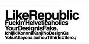
Fuckin'Helveticaholics

pattern01.jpgyou design is fake... (yes I know the many arguments that redicule that statement (like helvitica is like an unwritten book - the reader writes it with its own emotions (the only argument that made me accept helvetica as a design choice - all other I would throw the YourDesignIsFake statement in the face)))

found at the endless ffffound

20.03.08

A whole book full of vintage logos on Flickr

vintagelogobookolypics70s.jpgSomeone called Mr. Carl has scanned in an vintage book with vintage Logos of the past. All in full b/w glory. Really worth a look.

See the full book here.

16.02.08

A poster per gig

queensofstoneageposter.jpgGigposters.com is a website that collects posters from bands advertising their gigs. Famous unfamous big small good bad ugly. Have a look.

13.02.08

Net advertisement is ineffective across the board - who would have thought

I never understood how google is making these shitloads of money because I can not believe that "click throughs" most of them accidental give advertisers any kind of leg up in the market. It seems my suspicion is right as a recent article on slashdot notes:

"A recent study finds that 6% of Web users generate 50% of the click-throughs. Worse news for advertisers: these clickers are not representative of the population as a whole, most have incomes under $40K, and their clicks are not related to any offline buying. (They are mostly males between 25 and 44 years of age.) The number of clicks on an ad campaign is also not strongly correlated with brand awareness for the ads' subject, according to the study. This is bad news for ad-supported Web sites and businesses, as rates should drop if the Net economy begins to take these findings seriously."

JNo brand awareness - no translation to actually go out and by a thing neither online nor offline - so what the heck is the use of online ads - especially unbranded adwords in general? But my suspicion goes even further - advertising as a whole in its current form of super branding and subtle force buying has seen the end of life on any media. People are over saturated by XX thousand brands competing for their brain cells and actually people find they might wanna use their braincells for something else. I would say as with the decline of TV we will also see a decline of advertisements in the coming years - now the question begs -> no brands -> no advertisements -> no free money -> no free culture? or is it free culture -> no brands -> no money -> no advertisement?


7.02.08

Cultural Revolution Clipart

chinapropagandaclipart.jpgcommunist propaganda art - check
red / white / black - check
vintage - check

The Cutlural Revolution Clip Photoset on Flickr is for the time you are in the need of that special something for a next left-wing conspiracy party or when you want half a billion people almost starving or kill about 2 million indigenous people. Looking at communist propaganda vs. western propaganda (not only vintage) makes me think that the communists seem to be much more positive in their message over all then the fear mongering kapitalists.

See more of it here

6.02.08

Posterwhore - a blog with only posters

262_1200974331.jpgIf you like posters this is the blog for you. The guy running the blog posts posters that he found on the net and elsewhere but also lets ANYONE post posters to the site - also for selfpromotion. Have a poster? Load it up there...

posterwhore.com/

5.02.08

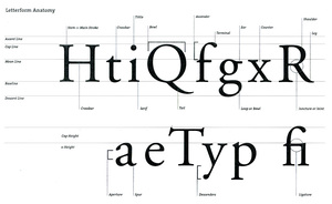
The FontExplanationSheet

TypeExplanationSheet.jpgIf you are like me and never can remember certain names for special things then you like cheat sheets. Here is one for Typomaniacs.

17.12.07

Atlas of Radical Cartography.

atlasofradicalcartography.gifAn Atlas of Radical Cartography is a collection of 10 maps and 10 essays about social issues from globalization to garbage; surveillance to extraordinary rendition; statelessness to visibility; deportation to migration. The map is inherently political-- and the contributions to this book wear their politics on their sleeves.

and it looks very pretty and powerful from the "look inside this book" that is offered on the website...

www.an-atlas.com

Trajan the Movie Font that rules them all

trajan.jpg A hillarious movie rant on slashfilm.com about the over(ab)use of a single font: Trajan. Its on movieposter, titles credits -> everywhere.
All horror movies released in the past 5 years have it so does AI, Geisha, HotelRuanda and about any other movie out there. Its the font to rule them all - so the guy in the video (who I probably should know but I don´t some typophiles out there probably know him right?). Creativity in Hollywood 2.0.


8.12.07

Funky Forest: Virtual Reality with eco shic for children

funkyforestangle.jpgImmersive Environments get more and more press over the years, as they finally become more rich and interactive. Its not only the "Goggle 3D thing" anymore its also blackboxes. One of the funkier ones I have seen and one that serves to teach children a bit about tree growth (namely that they need water to grow ;) and is generally great looking is Funky Forest. Children can create trees with their bodies, divert water with handmovements all in a immersive four walled environment that has some style.

9.11.07

Photoshop to get new UI - Gimp too!

Yay..... The news could not come at a better point - just when I was about to ramble about the interface clutter that programs produce - now that my OS of choice does not produce so much clutter anymore (hey I do have the feeling I am in control of my computers again :) the next problem is the programs themself. As I consider myself pretty much a poweruser (anyone seen my open programs can acknowledge that I guess) there is a HUGE problem - program UI and keyboard shortcut consistency.
But it seems the days - at least - the program User Interface has been living a live of a neglected child are counted. Senior Adobe product manager John Nack himselfs believes they have raised a bloated monster ready to drown any second - and I give him right in every sentence. The solution for Adobe would be to make the interface more customizable - he says. I would say make the freaking program itself more modular - let me make snapshots of modules that I like to work in my workflows and let me save those snapshots to carry around with me (on my nonexisting iPod f.e.) and make the snapshots FUTURE PROOF - I don´t want to sit and reconfigure something as fundamental as a pixel editor everytime they release a new version (in other words - do it right from the beginning and future proof).
Modularity is the key as Apple already figured out when they made Opendoc (the best teck ever to come out of apple in the last 20 years I would say - toooo bad they killed it with OSX but their "services" are a step in this direction - think of opendoc as Everything is a module and can be reused by everything else - say use the photoshop paintbrush in maya by actually loading in the photoshop paintbrush into the maya interface!)
The problem with a photoshop interface redesign - they need to make a "compatibility" configuration that looks just like photoshop 1.0 because everything else the older designer generation will just not buy (the biggest problem in modern interface design today is that "old school" user bitch about every small UI change and its really time to rethink the interface itself from the ground up)

A bit easier this is for gimp as its only users to date are people who otherwise use the command line (flame me please - but its a fact) so every interface must look like heaven to those poor souls. While I have bitched about poor Gimps interface for years there seems to be finally a growing consensus to do something about it - other then just badly copying Adobes already not so great interface.

The Gimp User Interface Group tries to find the godly ingedients to make an working interface that is actually used by graphic peeps rather then programmers. The sad thing: While they have the opertunity to make some (r)evolutionary that departs from every modern day UI, because a graphic program has the all the option imaginable to make it work better then anything there is or has been out there - the interface on their website looks like - oh wait no - photoshop. While talking about details is great ITS NOT GREAT IF THE OVERLAYING CONCEPT IS INCREDIBLY FLAWED! Layers are soooo 90is. One dimensional interfaces are so 80s!

To all people who are designing interfaces out there: TRY SOMETHING NEW or at least LOOK WHATS OUT THERE ON A BROAD SCALE (not only image manipulation f.e. but database handling, node editing etc).
The programs and workflows have become so endlessly complex that a complex interface is NOT the way to go!

simplyfy make it multidimensional context sensitive and modular and future proof and interoperable and standard conform and build in possibilities to easily hack it down to the core. And try to get rid of the fucking windows! I spend more time trying to find the right window burried in a stack then I am designing (at points that is of course).

5.11.07

Fonts for Science - stiX

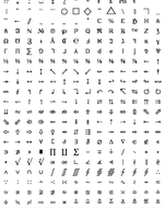
stixprev.pngIf you ever tried to layout a scientific paper (once I had to) you noticed that just when you choosed a nice font you had to put in two dizillion of other fonts just to get all the special characters that this specific scientific project needs. That is if you find them at all. No more of that says STI - publisher of lots of scientific journals - and opened the open source free Scientific Font package.
What you get is 30 different opentype fonts - mostly wit a "Times" appearance but also in Fraktur (!) monotype and sansserif - with about all and every scientific symbol on the planet all free for your download pleasure. Still at an "open beta" stage at the moment but already available for download here:

http://www.stixfonts.org/


Technorati Tags:
, ,


11.07.07

Gimp User Interface Study

The Gimp is arguably the biggest thread to Adobe and the biggest hope for a Linux on every desk as the biggest argument by most people that I know is: I can not run Photoshop on Linux therefore I have to stay with MacOSX/Windows - its a bigger problem for the adoption of Linux in my opinion then the lack of games. But then the Linuxusers are telling me "oh but there is the Gimp. Its even more precise and much more powerfull then Photoshop." Yes that may all be, BUT its coherently unusable. The interface is - like most Linux user interfaces that I have seen - total rubbish and absolutely unusable unless you like to inflict wounds upon yourself. Its unorganized, it gets in your way, its ugly (as in "its not clean and coherent"), its unusually complicated. My opinion has been for years "fix the gimp user interface to something dramitcally great and the rest of Linux will follow and Linux might have a chance on the mom and pop desktop and at the same time break the monopoly that is Adobe". A new attempt is under way as this slashdot article points out that installs a surveillance plugin to gimp that reports what you are doing inside gimp to a central server where it is then evaluated by a team of researchers at the University of Waterloo lead by Prof. Michael Terry. While I think its a novel approach to the problem I don´t see how it would fix it. The much better solution would be to get a sample group and watch them work as this is the solution for every userinterface out there. Ask them tons of questions and then GET AN INTERFACE DESIGNER to make the interface and NOT a group of researcher and NOT a group of programmer hippies, because have proven over the last 15 years that they are incapable of making good interfaces. I had a call out for an open interface design guideline manifest a couple of moons ago and I still think that would be a great idea.

24.06.07

Light Emmitting Fabric Available to Endusers

Jacket.jpgA very long time ago I wrote about a cool invention - a special kind of fabric interwooven with glassfibres where you could put colored LEDs on one end and the whole fabric starts to light up in the color of the LEDs. I stumbled over that tech again today and its actually available for bying. Sadly the company called "Lumigram" seemingly holding the patents and marketing this knows nothing about the latter - marketing. Their website looks like it came out of a internet horrorflick of the early 90s and the actual designs of things they market with their very very cool fabric are pretty similar bad - and since only economy of scale would make such a product affordable for joe and jamie we will probably wait until the patent becomes fair game to a wider market before the prices get into any kind of affordability range. But if you have 200 Euros to spare you can see your girlfriend run around in a poorly designed lit up top or for just 1000 Euros you light up your whole 4,00m x 1,50m dinner table with some selfilluminated tablecloth (good thing you can not do anything wrong designwise on a tablecloth - this company would have).
LumiGram clearly should just sell the patent to true design companies who understand something about it and should continue to innovate interesting fabric - the enduser game is something they are not well prepared to operate in and it would be sad to see such a nice tech go down the drain because some management people are to greedy and "wanna do it all" instead of letting people with some understanding bring this to the market.

17.06.06

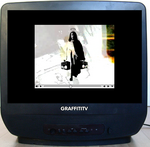
GraffitiTV

GraffitiTV.pngIn the dire need of inspirational input I stumbled across the Graffiy TV Website wich hosts a collection of Graffiti related videos from all over the web. Superb interesting to watch. I just wish they would put them in an edited magazin form - ala the Grafiti Mags of the 90s just in video and on the net. Grafiti more and more becomes like the only artform that seems able to make a nice transition from the industrial to information world.

8.06.06

Psyop advertising agency

psyop.pngNot often do I get around a advertising agencies webpage and even remotely think it might be worth mentioning. Not so with psyop. Away from "bauhaus is the end" they have produced beautifull organic commercials for big corporations like AT&T, Nike, MTV etc etc. Their gallery with videos is an absolute must to see where organic design (as in shapes and forms not as in nature preserving) has moved to recently. Their use of particles combined with hand-drawn art and logarithmic functions is outstanding.
For the graffity artists around here (and there are some that read that blog I know) check out the "coflow" spot that sports flowing tagging in a subway environment - absolutely awesome. For the typography freaks there is the spot "teletext" that uses type as particle foundations. And for the VJs and advantgarde people there is the "MTV HD" spot worth watching as its a superb symbiosis of sound and vision.

psyop.tv

Design in balance with Nature

re-norusih-logo.pngDesigners who care about nature and want to create in sustaining harmony with mother earth have now a website that is half blog half information resource about papers, printing companies, designer shops and general information all in regard to sustainable, clean, fair design. So still a little light on information this is a healthy resource for otherwise uncaring designer community.

re-nourish.com

Coolhunting Designers Blog

coolhunting_logo.jpgA site that has until now escaped my radar is geared toward designers. The writers seem to be located in New York and its a professional for profit blog. The reports so are quite nice and very diverse. There is something in them for everyone interested in design, modern living, moneymakingsubculture and audiovisual arts. A video part rounds off this endeavor - this time featuring the most tattooed person on earth.

coolhunting.com

5.06.06

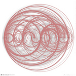
Circles around del.icio.us

deldiscoveryred.jpgEver since my interest in the interface design side of all digital things has been spiked through my school opening an interface devision I do look out for the next generation interfaces that might make the life of a information junky and digital lifeform easier and maybe even more understandable - so most interface designer out there seem to rather like science art then interface design and are presenting pretty pictures of lots of data to the world with claims about saving the world with them. One such example is the "del.ico.us.discover". Wrapped around the de.licio.us social bookmarking service owned by web 2.0 yahoo its supposed to be a commentary to social bookmarking from the view of the creator. While it produces some nice pictures - and I do like data visualization from an aesthetic standpoint - it falls flat to show me anything on the first look - and that is what such a project should be targeted at - giving you an overview of data that you understand at the first look - read Mr. Tufte on this subject - while creating beautiful pictures you get each and every of his presentation on first or mostly second look - the del.discover art is just pretty pictures that where generated with some formula - an exercise in Flash programming. Yes if you dig deep into it you can actually see what is meant by it but again the hype vs. utilization factor is still very much on the hype side. The graphs he shows before going all "cirlcly arty" are much more clear and are worth digging into - he should have made those a web application and accessible to others to put in their data instead of just his own - you know its web 2.0 time and all is about participation especially if you are commenting on social bookmarking that is about others more then yourself. But yeah pretty pics in pretty style.

de.licio.us.discovery homepage

4.06.06

FX Tutorials for the masses

I thought "oh no not another site that collects tutorials" and my worst fear came to true. pixel2life.com is sporting a web 2.0 interface to more tutorials of popular animation and still visual FX application then you can read in all of your life. Why I think its bad? Because there are about a million of them out there already and finding just the special trick is already like looking for that needle in the haystack - well the haystack has just outgrown the barn and you have to look for the needle in the rain now. While more information on anything is always welcome I think as long as a somehow standardized tagging across all those tutorial sites springing up everywhere is in place it adds to confusion for the users looking for a quality tutorial on anything. I would love a proposal by those companies selling those nice software to have an open (source) api that those websites can use to aggregate tutorials - but in the competetive world we live in everyone cooks its own soup and you have to spend the tight minutes in the production environment searching through another site for a solution that was caused by a bug in the programm in the first place. Anyway I still consider the HighEnd3D.com and HighEnd2D.com sites the best around for the true professional fxlers - the most knowledgable people working in this field (also outside "the industry") hang out there and the scripts, tutorials and message boards are the place to flock for the advanced interests. As for the hobby and casual user pixel2life will probably appeal with their flashy rainbow interface and lots of icons that suggest lots of content.

19.04.06

Comicbookfonts

comixfonts1.pngcomixfonts2.pngcomixfonts3.pngcomixfonts4.png
Not much to say other then there is a site now that exclusively sells those crash boom bang comic book fonts in high quality. They come in different categories and such so if you ever want to write a comic book this is the place to get the font from - as most free comic book fonts suck badly and quality is mostly below anything usable.

http://www.comicbookfonts.com

A Title sequence to die for - Thank you for smoking

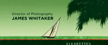
ThankYouForSmokingTitleSequence.png
Rarely do you see nicely executed title sequences these days. Via the eyebeam I stumbled across the Thank you for smoking title - apperently a new hollywood film. The title sequence is so nice that I didn´t even bother to check out the film or the trailer yet. The title sequence is luckily available on its own. It sport an impressive display of about 28 cigarettes packs where the names of the cigarettes are switched out with actor names, director names, etc. Very nice idea and extremely well executed - also the blendovers from one to the next are extremely nice. The typorgraphi blog has taken apart all the titles and lists the font names to each and every one. (except five that seem to be custom made or handwritten).

18.03.06

...is the beginning - elevating Live Cinema into the mainstream

My six month diploma project will try to combine what I have learned in my study and in my over 7 years of VJing. In official close collaboration with vidvox the diploma project will depart from the "old" VJing metapher and dive into the new realm of "Live Cinema".

LiveCinemaResearchLogo.png

The project description:

Live Cinema - a project as symbiosis of theory, technology and practiced synesthetic art viewed as spatial, textual and visual evolution and convergence of two communication-, design-, culture- and art-forms.

So what I want to do is to fuse "cinema as we know" it with "VJing as some know it". All that together with a written theory and a complete project that will be performed sometimes in very early September 2006 on a newly developed "live cinema" software program that is tailored by vidvox to meet the demands an interactive, reactive storyline would need. I am very exited about this project as it forays into a new media realm first outlined in the book "Live Cinema Unraveled" by Timothy Jaeger and the narrative VJ sets shown at AVIT 05.
Since most of my focus for the coming month will go into that project I have made a new Blog where I post progress and findings related to Live Cinema and also a Wiki where I will archive my findings. For the course of the project most texts will be in german - sorry I am still living here and have to drop off the theory part in german - yet if you feel like you have something substantial to contribute feel free to do so in german and in english - just register at the wiki or post a comment on the blog.
If you see lack of posts here on this blog it means there is probably much more going on at the live cinema research as the world of politics and future technology has to step back for the moment if its not related to that other project (which it still will through the story).
I will also write (and partially have already written) a story myself - I will post it to wiki and blog in addition I will post each and any progress I will make, including storyboards, unfinished production shots and when all is done one recording of the whole "film" and hope to get lots of critiques and helpful comments. I wish for interested people to join me in the roller-coaster ride to help define a new art branch. Please don´t be affected by the german language barrier - I try to cross post things in german and english and after the project is done and if it is actually successful I will translate everything in the wiki for the international artists interested in that field. I hope that at the end of the project both the wiki and the blog will continue to be a community resources for the time to come.

The Wiki: http://livecinema.prototypen.com/wiki/
The Blog: http://livecinema.prototypen.com/blog/

The end....

I have finally made it to the point in my communication design study where I am done with all official courses and "just" have to tackle that last project to get my diplom degree for design (german degree somewhere in the middle between bachelor and master). For much too long I sat in those rooms and listened to various people telling me about the tricks and tools of the design trade. I have listened to endless theories and have been involved in so many projects in the meantime that I lost count - and let me tell you not all where inspiring or cool or hip (designing the corporate identity for a tv channel for people over 50 is definitely in the unhip category - but was still quite fun). There have been projects that where utterly cool at the time (one of the first was realizing a marketing campaign for a new cigarette brand - the outcome where some hilarious short cinema commercials and a poster campaign - after a frustrating week of yelling at each other in the team) and some that never made much sense but brought my thinking much forward (the invisible interface for the project "Inhalt im Rauschen" programmed with max/msp/nato 0.55++).
Overall I can say yes I have learned a lot in my school time - about a third from my teachers, a third from my fellow students and a third from the actual projects. So I still don´t agree with the school policy to force you to take some courses that absolutely where horrible and made you really think twice if design is what you want to do the rest of your life. Yet I am happy to have been through it and despite the last project in front of me I can look into a future in my trade with a lot fundation to draw upon.
I would like to take that space here to thank a couple of people who guided me through, have been inspirational or fun to work with.

Teachers: Prof. Michael Bette for enlighting me on the concepts of color and psycholigic perception of the world. Prof. Angelika Margull for not getting tired showing me how to draw, Prof. Klaus Dufke for his dedication to the moving image medium (even so I am in disagreement of some of the pop.culture concepts of him, his dedication is admiring), Prof. Betina Müller for dedication of detailed Typography - even so I have not finished the last two projects I have learned soo much about Typography in her courses and I even like Typography and I think that is a result of her teaching, Prof. Matthias Krohn for the low-profile approach to design and the systematic dissection of the creative process and last but not least the youngest Prof. Boris Müller for actually getting some vibe going at the school again and encouraging me to stick through the final courses.

Students: Annett, Katja, Wibke, fRED, Michel, Olli & Sven, Andre, Alex, Mythos, Beppel, Steffen, Jörg, Björn and Stex and all those that I properly can´t think of right now but have been equally important - feel thanked for the great very inspirational fun time inside and outside school with you. The lengthy hot discussions long wakefull nights and the final sometimes beyond strange projects will stay in my mind for the years to come.

I hope for a bright future for all of us so that all the suffering actually made some sense.
Study Interface Design and simplify the world

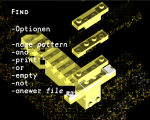
CommandLegoInteface.png incompixow1_0.pngI have started studying Communication Design some long time ago as I was coming from the computer side and had an affection for creativity due to my exposure with the medium video - so Communication Design appealed to me as a path to my life. The school I choosed was the University for Applied Science in Potsdam (for all who don´t know - Potsdam is a medium sized city just on the south-western outskirt of Berlin and known for Cold-War spy exchanges and Prussian Kings). The design department at the the time was very energetic and the general feel in that old Prussian/Russian military complex that had been declared a school shortly after the wall came down was very inspiring. Much has changed over the last 6 years there - the old building have been renovated and a huge new modern laboratory complex has been build. The design department when I started there had two different but very complimentary courses - Communication Design and Product Design. You had to take a lot of crossover classes to get a degree in each of these. Yet over the years the energy has gone away in the traditional design market and that was reflected in our school as well. To renew the schools bid to be a leading design faculty they integrated a third and more modern part into the department - Interface Design. While I got bored with the uneventful classes in traditional communication design and even more bored with any product design classes the lecture offers for Interface Design grabbed my interest. Two project that I am most proud of came out of those classes - The Command Lego Interface (55 MB mpeg4 video) and The Pixow Screen Saver. If I would have the choice today I would love to get a full scope on interface design with all its facets and especially inside that product/communication designer environment it makes a lot of sense - from what can be seen in the other interface courses the outcomes are usable chic portals to the digital world. As I am struggling with overly complex ugly interfaces every day I would like to encourage anyone thinking about studying design to consider Interface Design as her/his bright future in the hope that the miseries of an over-complex world can be tackled by talented people.

If you seriously thinking about studying Interface Design the application deadline is April the 1th and I can highly recommend this fresh department either if you want to get into actual hardware interfaces (think cellphones, iPod clickwheels and the like), game interface designs, web design or have that ultimate idea that has not yet seen the light. The close proximity to Berlin (30 min by local train) is a very beneficial inspirational source for everyone that needs that metropolitan feel to get into a creative mood.

The website is completely in german but foreign students are very welcome. You can get into a Bachelor or Master of Arts degree.

Find the application here.

More Projects from the course here.

5.07.05

The future of the web is not the browser

incompixow1_0.pngMaking tools myself that take information in form of rss feeds and xml streams etc. and putting them into new cloth I get more and more the feeling that the future of the web sits not inside the browser window. As more and more information comes available this information craves for the attention of the world population and to distant itself from other information the browser seems not the best tool. I am not talking about flishy flushy flash sites I am talking about proper use of this information and using them in a manner that presents the information so its easier and faster to understand and comprehend. Its tools like widgets screensavers blogtvs tickers and tools that will yet have to be invented that will take the web to a version 2.0 where information is not only many and pretty to look at but also will be presented in a form that will make it easier to follow the information trail that is of interest to the viewer. For now take a look at my screensaver that I did for the incom workspace tool of the University for Applied Science Potsdam to see a concept of what I mean. Pictures and user definable RSS streams are mixed to give an outsider an overview of the school and its workwebsite presence, the newcomer a way to find use for the tool and for the insider user a nicely way to follow what is going on while taking a break. I am not saying its anything new I just come to the conclusion that this is where part of the web is headed and I really like this.

PS:The screensaver is programmed in Apples Quartz Composer and runs only under MacOSX 10.4.1 Tiger and with a graphic card of at least 16 MB. I would like to thank Pierre-Olivier Latour the Quartz Composer Architect for his help throughout the little project.

1.10.04

Must have AntiAmerikanPropaganda

One of the nicest crafted movies in a long time that talks about the project "American Century" has come to my notion. Its a must to look at the blend of 2000 style visuals with an appearance that reminds you of old film and the deep message within with a very nice use of graphical language throughout. Have a look.

http://www.knife-party.net/movs/barry.mov

26.03.04

Open Source Interface Design Part II

Mr. Raymond has spoken again responding to the feedback he got from his first rant against Open Source Interface Design. And again I can wholeheartly agree with him. The responses he got seem to also support his thesis out there that there are even a lot of "powerusers" of Linux and the like not satisfied with the current state of Free Software Interfaces.
That made me think a little further and I think its time for an Open Interface Initiative. You know there are lots of Designers out there who I am sure would dedicate a little time for designing interfaces.

The biggest obstacle seem to be either you are a programmer then you probably do not have the time to study user behavior and try to figure out how an interface would look like that best suites the user or you are a designer and then you have no desire to care even a little bit about coding (and most hate it - except for some rare few crossbreading exceptions).

So there must be a solution to bridge the two breeds. Something beneficial for both with a minimum amount of friction. Maybe a platform where the programmers post their requests with hooks to the code (like programm xy can do zx please make us an interface proposal). A rating system. Maybe even a "Interface Testbed" where you can throw in an interface and test the functionality without a working code underneath - that could be in itself an open source project. The standard interface or the like.

As Mr. Raymond says its hard to gain any market share for the OpenSource if there there are only interfaces that even the hardcore computer users find hard to manage. Some people want to consume and not think about their computers (the invisible interface).

27.02.04

Open Source and Interface Design

Oh no I said both words in one sentence. Eric S. Raymond has a written a piece on his homepage about his experience of trying to configure cups. Beeing in the cups "interface" myself ones in my life I can clearly see where he is coming from. Yes the command line is fast. Yes the command line is beautiful, IF you have no girl and if all you do your whole life is trying to figure out how stuff works. If you want to get stuff done sometimes there goes nothing over a single mouseclick.

He writes:

The point of this essay is not, therefore, just to beat up on the CUPS people — it's also to beat up on every other open-source designer who does equally thoughtless things under the fond delusion that a slick-looking UI is a well-designed UI. Watch and learn...

Seeing that the new Gimp(2.0) has a somewhat improved interface I think there is more and more awareness in the Opensource field that this might be an important point to bring the non geeks to the Opensoftware movement. I do not say that the movement should look at Microsoft, Adobe and co. they do have the power to do things differently, but remember always ALWAYS have the user in mind when creating an interface. It does not have to be flashy hip it just needs to work fast and reliable just like the command line. I have friends with PCs that hate Microsoft some tried out Linux, they are not unintelligent people (in their field they are quite good) they are just no geeks and they throw out Linux after a couple of days figuring out only the most fundamental stuff and not getting anything done.
The constant ignorance in the opensource movement in regards to interface has to stop if they want to succeed in the long term.

26.02.04

How would you design the google interface?

In an article on wired about all things goooooogle there is a section that interviews a couple of interface designers about how they would redisgn the google interface. They are "interface designers". I wish they will never ever get a job. No wonder that most of the interfaces that I use daily suck so bad when I see that. They must have mistaken interface design with abstrakt art or something. Gosh is that bad, espicially the alleged "propagandist" a little way page down. Why not make google only work with flash, then its all blinky blinky.

14.12.03

Powerpoint presentations that make you numb

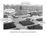
Yes I reedited the capture a little from the others. My favorite information "making looking nicer" Mr. Edward Tufte from who I read three books is all over the news. First NewYorkTimes then Wired then slashdot and for now last but not least heise. So I figured if all of my favorite news outlets are reporting on this I might take a look as well. The start of it all was an essay by tufte in which he states that the part of the Shuttle disaster might be blamed on Microsoft Powerpoint (oh the faces in redmond I want to see them).

What he has to say is nothing new to most of us. Most Powerpoint presentations are ugly. I would say that powerpoint is indeed capable of producing nice informative screens but the casual user is grabbing for the easiest way and that means in terms of power point: chart making wizards, clipsart libaries and the arial font. So Tufte says that the the limited screen resolution makes it impossible to present any meaningfull chart tables with an sufficent amount of data. I want to disagree a little bit with Tufte today as I feel for a little word fight. Yes screen resolution is a limiting factor for nice flashy looking graphics that are pepped up for the bored office guy but even in Tuftes Books there are plenty of images that work with pure pixel data and equality checks are made by pure pixel size. Having mostly beaming resolutions of 800 x 600 pixels I would say there is a sufficient amount of space to present tables - but only if it is used wisely and made with some custom art program because the point where I totally agree with Tufte is that the charts coming out from the powerpoint wizard simplify things that can not be simplified and over-saturates the viewer with blocks, colors and lines that are completely meaningless and have no apparent connection to the visualized problem.
A problem that I have not seen Tufte mention is the boring factor. I would say that the office guy who sees the same look of a chart over and over again might not pay attention anymore. I mean the graphs are totally disconnected from there meaning (you oughta read Tuftes books for more on this) and look about the same again again and again. Subconsciously failing to recognize some important data out of the hundreds of about the same looking graphs is only a human thing. Nice point on this day where the other news was mostly more important to others... Interesting that the NewYorkTimes article mentiones Mr. Powells failed attempt to "proof" that there are Weapons of Multitude Destruction to the UN security council in February with a PowerPoint slide - I almost fell of the chair laughin...

10.12.03

Project Looking Glass - a new 3d interface that the world don´t need?

After some failed attempts by others SUN is trying to pull the 3d interface. Nice and shiny 3 dimensional cds and "true 3d icons" on our 2d screens - just what I have been waiting for - more clutter. Is this really what we need for a better computing experience? Is the 3rd dimension the saviour of our screen estate. I look at the picture and I think, great for playing around but can I do work with it better faster and be better organized because I have CD´s in front of me instead of words. Its the whole "an picture says a thousand word but a word can say more then a thousand pictures" discussion that we can talk about until the end of the world. GUI or CLI - 2d or 2.5d - real photos or icons.

In my search for the word hotsauce I came across some old and new friendly website given you some indepth understanding why 3d (2.5d) interface are not the future you want to have and while you are at it you can check out a 3d filesystem interface for OSX.

some more links:
the one and only nooface.com
3D Interfaces to Hypermedia Information Spaces
"great" slides about designing 3d interfaces
3d - a new paradigm for user intefaces? some slides
3D Graphical User Interfaces for Web Pages - gosh I wish sometimes they look at the stuff they publish
and another link to the defunctional apple hotsauce project

2.12.03

Corporate Logotypes

Here are two very nice sites in case you need that sponsor logo (for hq print)and the sponsor sends you a 100x200 pixel 50% Jpg. I lost those links now for the second time so I think its better to put them here.

logo.nino.ru
www.logotypes.ru