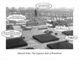
Powerpoint presentations that make you numb
 Yes I reedited the capture a little from the others. My favorite information "making looking nicer" Mr. Edward Tufte from who I read three books is all over the news. First NewYorkTimes then Wired then slashdot and for now last but not least heise. So I figured if all of my favorite news outlets are reporting on this I might take a look as well. The start of it all was an essay by tufte in which he states that the part of the Shuttle disaster might be blamed on Microsoft Powerpoint (oh the faces in redmond I want to see them).
What he has to say is nothing new to most of us. Most Powerpoint presentations are ugly. I would say that powerpoint is indeed capable of producing nice informative screens but the casual user is grabbing for the easiest way and that means in terms of power point: chart making wizards, clipsart libaries and the arial font. So Tufte says that the the limited screen resolution makes it impossible to present any meaningfull chart tables with an sufficent amount of data. I want to disagree a little bit with Tufte today as I feel for a little word fight. Yes screen resolution is a limiting factor for nice flashy looking graphics that are pepped up for the bored office guy but even in Tuftes Books there are plenty of images that work with pure pixel data and equality checks are made by pure pixel size. Having mostly beaming resolutions of 800 x 600 pixels I would say there is a sufficient amount of space to present tables - but only if it is used wisely and made with some custom art program because the point where I totally agree with Tufte is that the charts coming out from the powerpoint wizard simplify things that can not be simplified and over-saturates the viewer with blocks, colors and lines that are completely meaningless and have no apparent connection to the visualized problem.
A problem that I have not seen Tufte mention is the boring factor. I would say that the office guy who sees the same look of a chart over and over again might not pay attention anymore. I mean the graphs are totally disconnected from there meaning (you oughta read Tuftes books for more on this) and look about the same again again and again. Subconsciously failing to recognize some important data out of the hundreds of about the same looking graphs is only a human thing. Nice point on this day where the other news was mostly more important to others... Interesting that the NewYorkTimes article mentiones Mr. Powells failed attempt to "proof" that there are Weapons of Multitude Destruction to the UN security council in February with a PowerPoint slide - I almost fell of the chair laughin...