An inside look at the hot dotted mac cat
Or the nitpicky Leopard longtime user review
As some of you know I am actively involved/enrolled with the Appleseed which is apples closed beta testing group for a lot of their software. I have been doing just that since about seven years now and its always a lot of fun mixed with a lot of frustration and a lot of pleasure if you see the bug that you reported fixed or that enhancement request you did make it into the final version. Recently I have been actively involved in Leopard testing - for the last 14 month that is.
As we Appleseeder are halfly lifted from our non disclosure agreement with the release of the final version I would like to talk about a user perspective in the OS for a short paragraph.
Its been a slow coming and a lot of builds I could not test because my equipment was not compatible but in the end just a month before the release they send us a build where magically a lot of problems went away - yet the first time I installed Leopard I got this urge not to go back - even so I did not see any major improvement that would justify this reaction. But its the small things and now after the 14 month I can safely say that I have never ever seen such a productivity improvement when upgrading to an OS.
My absolute favorite - and once you get used to it you gonna see why - is: SPACES.
Designate spaces for different work conditions (one for 3D, one for video editing, one for still picture editing, one for office stuff, one for system stuff f.e.) assign programs to these spaces and remember what space number is what and all of the sudden all messy window overlapping is past – forever. I can not stress how great this works and urge everyone to take the time to set up individual spaces (drag and drop apps you use into the space preference panel and assign a space number). Spaces is whicked fast even on my old (now dead) Titanium Powerbook 1Ghz.
Time Machine is a mixed blessing – while I like the idea the whole thing is a typically 1.0 version. I personally would not use it and I know that some testers had serious problems with it. The lack of fine graned controllability is a real bummer – an "advanced setting" button is missing – I hate it.
Safari had been a surprise – I though it would suck first but the new search is amazing. It is the first search that real gives you a visual feedback – I love it totally.
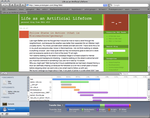
 Also the new DEBUG menu goes long ways – not Firebug yet but already very close with full inspection of boxmodels, load times, page code etc – great (you have to enable the debug menue to see this in action).
Bluetooth and syncing is vastly improved in speed and stability.
The new dock is a step up I guess but nothing revolutionary. I do like to use the stacks as launch managers for programs – for anything else they are useless as they only display a certain amount of files and I find myself to just use the open in Finder button inside the stacks all the time for folders that change content a lot – spaciality is not Apple core competence these days and as soon as you do serious stuff that is still a big problem.
BUT they are making headway's here and there. The "new" finder had been a huge disappointment for me at first as they put up a new face without fundamentally change the underbelly – this seems to have changed a tiny bit so in the latest releases after a big backlash inside the seeder community. I can care less if we have coverflow in the finder, but I see the reason why it in there. For me the only possible reason to put coverflow inside the finder is to use it with a multitouch input device because coverflow with a mouse is just painfully slow but I can imagine it to be great to flick you fingers through your files this way. Generally the finder window is MUCH better then before. It seems more ordered and once you get over yourself and accept new things bring change it is actually quite usable. And, hey, individual windows REMEMBER there setting now. So when you set folder to list view next time you open it it actually opens in list view. It took them 7 years to get this functionality in since the seeders posted a million and one Enhancement requests about it but hey better late then never. Sadly so it still does not remember where the window was placed last time you opened it – this is still the single biggest problem for me in the finder interface. Oh and still no tabs in finder windows :( The underbelly of the finder did improve magically in the last two - three builds. Still no "live" finder but you can at least reliably force reload folder contents by reopening the folder (no that did not work before). And generally it seems a tid faster when copying and it does not lock up when there is a server missing (at least not more then 20 seconds – much better then the 10 minutes it used to under tiger).
Screensharing rocks - its solid mature and fun. Not much more to say about it. Its one of the things you ask "why not earlier" but the clean integration and the speed and the quality of the screen cast is just what you would expect nothing more nothing less and all without installing anything – I can see Apple going a "virtual desktop" route with this sooner or later, I strongly expect more on this front (true virtual desktop as they had in NeXt). I have a space with my server and my two g5 on my Powerbook and can control the whole office with just clicking "ctrl 5" which gets you to space 5 and to full c to your comps – again GREAT.
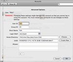
The rest is all small things scattered throughout the system. Especially the System Preferences have seen some great improvements, like better Networking features.  An advanced tab for user management to set you home folder to somewhere different (YAY! no more netinfo mangling). Filesharing with access lists also works incredibly well and you can set sharepoints which is an appealing concept (so it does have its rough edges).
There is a LOT of things for developer, since I am not one I can not comment to detailed on them. But one thing that is great for me is that you can now use RSS in Quarz Composer files that are not Screensavers (something that was disabled in Tiger because of the fear of intrusion through that door). So you can make a Quarz Composer Composition with an RSS feed and have that play through Quicktime on a webpage.
And while I am at it: Quicktime. Its the same old f*$k s%&t under the belly – even worse I have reason to believe it has seen a serious performance decrease. If you open lots of movies (above 200) it crashes it drags down the system and generally I would hope one day Apple takes the gagantuan task to replace it with modern code - they might do just that with the QTKit but its not beeing used by QTPlayer yet it seems or they just copy and pasted code from old Quicktime to QTKit. They should just use the codebase of VLC and make Quicktime opensource and have the coder/decoders closed or something - the current state of affair is not acceptable.
BUT I do like the new overlay interface acrros the board. Very great interface desging not getting in the way and absolutely minimal but usable. Great. Same goes for the new DVD player overlay interface.
Oh and I almost forgot to mention QUICKLOOK. As with spaces it seems to be a small addition but it is one of those productivity boosts that you do not see at first but once you use it more then three times you can not let go of it. Select any type of file hit the space bar and you see a nice overview of all the files or a bigger preview of just one file (you can scroll through all of them). It previews about everything a normal user uses and is extendible via plugins to preview even more - it can go fullscreen. Next time you get a USB stick full of photos and text files and pdfs and movies (yes it playes QTMovies faster then QTPlayer ;) and whatnot you see this as the most incredible thing to save you some time looking for the right thing.
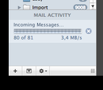
Another thing I want to talk about is Mail. The epicenter of love/hate inside me. Its been improved A LOT in my opinion. That it just "sees" dates and adresses inside a mail and lets you easily add those to the calender/adress book is just damn splendid. Overall it also seems faster and more reliable. But the new features are a bit on the slow side – especially RSS feeds. So I do love them inside mail much more then inside Safari (a hot debate I can tell you among us seeders), its just not quite there yet, but I see mails interface as the better one for managing and archiving the feeds. Notes are also great but I have not found extensive use of them.  A very welcome addition is the new small activity monitor that you can enable in mails main window bottom left corner.
New iChat is a very nice evolution with tabs seeing the day of light (finally) but in typical apple fashion are integrated just lovingly. Conference videostreams are going to be hip especially as you can show someone you vacation video through iChat while in the conference :) iChat theater supports any fileformat that Quicklook supports btw. - on the server side. The client side does not need all the Quicklook plugins to see the content as its streamed as plain ol video.
Calender has been missed in most reviews I have seen yet it has seen a fundamental shift. First of all third party application can now seamlessly communicate with it (that was a pain under Tiger if you ever used a TimeTracking program). And the general editing a date interface has changed for the better, in general its MUCH much faster in the interface.
Other smaller improvement of note to round this up is tabs and better visual presets in Terminal. A better cleaner console.app with color/icon codes of errors and a vastly improved automator with a record function.
Overall I do not see this update as a "minor" one anymore even so it seemed like it at first. All the small improvements combined do make for a much improved experience - especially for power users (I do not see normal users benefitting THAT much). I do not have the final final build so I can not judge stability in general but I can say that it might be rough on the edges still and if you want a fluently working system wait until 10.5.3 at least.
My only wish to Apple at this point – put in the full ZFS! (oh and FTFF and the FQT).
If you have any specific questions you may ask in the comments and I try to answer them.
Oh and ONE MORE THING: Backup EVERYTHING before you install this cat it bites at times!
(this is not just a simple "backup always before you install new software" warning - this is a serious "you better back up" warning!)
Technorati Tags:
Apple, BetaTesing, OS X, Quicktime, Leopard
Comments
great review! very detailed and helpful! what a bummer that ZFS was implemented as read-only for now! i hope that the next update will support ZFS completely...
Posted by: Flux | 30.10.07 16:55