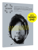
magazine review: sceen
 Last saturday at the Bermuda Visualisten open rainy air vj art happening Marcel Magis introduced me Alexender Scholz who in turn is the editor in chief and one of the publishers of the new magazine called "sceen". After a nice little too short chat he gave me their holy first issue to have a look and comment - and I do in public please forgive me ;)
The first impression - trying to forget what I had been told about the magazine - was "not again one of those". It looks at first as a gazzillion other magazines look like - standard format, high gloss printed color pages all in a neat but clean swiss layout (even so they spare you with the swiss font and throw in a serif for the body text). Not overly exited I opened up a random page and started reading. "Hell what is this" .. I thought ... "its in english"... after reading half a page - what a nice surprise in todays globalized world for a magazine revolving around the underground technology scene. Reading the articles randomly I was stunned how much they would suck me in - at least the ones from the featured demo scene festival, the interviews I liked as well. Turning the pages toward the "vj" part of the magazin I was dissapointed again - two 4 page artikels only revolving around tools and some thoughts of their creators - not a single article dedicated to content or philosophy of vjing... on minus point so the articles about the tools were indepth, focused and something you wouldn´t read in DJ mag or similar mainstream press. Then I continued enjoying the interviews with the demo scene people that hack into cellphones and thought - I would like to do this - where is the demo code? So I popped in the DVD that is accompanied with the mag (all in the mags simplistic bright grey CI) and saw a moving picture of about every piece that was shortly introduced in the mag - a novum and something I extremely like but sadly still no code to tool around with.
Continuing reading I thought that the articles are all a little randomly distributed over the mag - 8bit sound, demo scene, vjing, more demoscene more music. Or even the structure within the articles seems experimental - something the layout wouldn´t suggest - an interview on the right half of the page and an article on the left half both continue on different pages - making you turn the paper again and again. In the end this was something that really supllements my reading stlye of magazines in general - highly unlinear.
Overall I still have not decided where this magazin fits in. Is it a geek mag? Then its definitely missing code photos of dissassembled gear and the overall layout is too "nice". Is it a mag targeted at the de:bug crowd - that would be too sad as it has the potential to add more depth to the highly "stylistic" articles in the other mag, or is it solely targeted at artists, then again I miss some small how toos or other hand on stuff.
In the end it served me as a nice inspirational resource. Its a nice place for crossbreading scenes to be discovered - realtime, 8bit music, 4k demo, vjs, pixels, netlabels. I just wish it would be a little more different and I really miss honest op-ed articles that show the opinions of the authors and would add a little more personality to the mag. Also a technology hands off part showing the real life as artists without the creations - having an insight into living styles and philosophical thoughts would be something I could see in there and a political standpoint - that most scenes referred in the mag have - may be essential to grab a loyal fellowship.
Its a nice number one issue with lots of potential. I had some good time flipping and reading. I wish the creators a lot of success and hope they reconsider the price of 6,50 Euro ones they have more advertising - or keep the mag mostly advertising free as its now.